

What is our identity?
Seminary Mission Statement
Southeastern Baptist Theological Seminary seeks to glorify the Lord Jesus Christ by equipping students to serve the Church and fulfill the Great Commission.
Judson College Mission Statement
Judson College seeks to equip students to give their lives for the cause of Christ in the Church, among the nations and in every aspect of society.
We believe that a unified commitment to these branding guidelines will strengthen the identity and mission of Southeastern's seminary and college both internally and externally.

Logos

The logo is central to institutional branding and represents the institution as a whole. When used by university departments and offices for their electronic and print materials, the Southeastern logo should be displayed appropriately and follow the standards described in this guide. Consistent and correct use of the logo contributes to maintaining and strengthening the identity and image of Southeastern.
To download our logos, click the download button for the desired logo group below. This will download a zip file to your computer containing multiple versions of the designated logo. Feel free to adjust the size of each logo proportionally, but do not alter the dimensions by squeezing or stretching them. Please apply the “Improper Usage” guidelines for the seminary logo to all logos. These logos are print and web resolution. JPG files have a white background, while PNG files are transparent.
This logo represents the institution as a whole. It is used comprehensively in all internal and external communications and acts as an umbrella identity under which all other Southeastern identities fall.
These logos represent Judson College in an official capacity. It is used in all internal and external communications that relate solely and specifically to Judson College.


This logo represents the effort to communicate the core value of equipping students to fulfill the Great Commission. It is used primarily in external communications that describe the mission of Southeastern in specific ways. In most cases, this logo should be used in consultation with the Office of Marketing and Communications to assure consistency of message.
2. Fonts
When working with the SEBTS logo as part of your marketing materials, please use the approved fonts listed below.
Utopia is our primary typeface, and Proxima Nova is our secondary typeface.
Georgia is our legacy typeface. The SEBTS logo is set in Georgia Bold.
More details on each font, download instructions, and free alternatives are found below.
Georgia
Georgia is a transitional serif typeface that has neat, round letters with large ball terminals, horizontal serifs, a sharply vertical axis, and high stroke contrast. Its character exudes classicism and camaraderie.
How To Use
Georgia is the typeface used in the Southeastern Baptist Theological Seminary and College logos and will continue to represent the brand in that way. As the legacy typeface, Georgia can be used to represent the brand in executions that are considered significant and enduring. It can also be used when emphasis or a strong connection to the logo is needed.
Examples of this include campus signage, important documents such as diplomas, banners, and vehicle or environmental graphics.
Georgia is already freely available on most computers. If you do not have Georgia already, click the button above to download it.

Utopia
Utopia is a transitional serif typeface that has a classic elegance. It has a strong contrast between thick and thin strokes, appearing both bold and approachable. The font comes with a variety of weights and styles to allow for a lot of flexibility in applications depending on the tone.
How To Use
As the primary typeface, Utopia is intended to be used in newly generated materials that are meant to feel relevant or current. Utopia should be used when the execution will be regularly updated or when new versions will be issued on a regular basis. Examples of this include all marketing or promotional materials, magazines, curricula, viewbooks, annual reports, social media, websites, etc.
Utopia will be best used in situations to call for attention, such as headlines, subheaders, and call to actions. The Standard set of weights should be the default, while the other styles can be incorporated as needed. When a sense of sophistication or impact is desired, utilize the Display, Subhead, and Headline styles. When wanting a friendly tone, utilize Caption. Caption will also be good for type at small sizes because its letterforms are more legible.

Proxima Nova
Proxima Nova is a sans serif typeface that combines a geometric appearance with modern proportions. It’s contemporary, clean, and approachable, offering complimentary characteristics when paired with Utopia. It has a wide range of weights, as well as condensed and extra condensed styles, providing plenty of flexibility depending on the application.
How To Use
Proxima Nova has so much variety, it can effectively be utilized in a variety of ways. The Standard style should be the default. When pairing with Utopia, it makes for a good body copy font since it is very legible. It can be used for subheadings and captions as well. It can also be used for headlines in place of Utopia. The condensed styles can be used for impactful scenarios like headlines or to bring emphasis to a specific word or phrase. Do not use the condensed styles at small sizes as it can become illegible.

Free Alternatives
When the primary and secondary typefaces cannot be used because they cannot be purchased or accessed with an Adobe CC subscription, these fonts can be used in their place.

3. Colors
Southeastern’s primary brand color is #002F7A for digital uses and PMS (Pantone Matching System) 287C for print uses.
This graph demonstrates the frequency of use of our colors. SEBTS Blue should always be dominant.
If ordering print products: In order for the Seminary and College logos to be reproduced properly, please only use PMS 287-C Blue or White for the official school logos.

How to use these codes:
HEX or RGB codes should be used when designing for screens or web and for desktop printing.
CMYK codes should be used when designing for 4-color printing (C=Cyan, M=Magenta, Y=Yellow, K=Black).
PMS 287-C should be used for Southeastern Blue if ordering print products.
SEBTS Colors

SEBTS Blue
Hex 002F7A RGB 0 47 122
CMYK 100 81 0 23 PMS 287 C

Dark Blue
Hex 000D44 RGB 0 13 68
CMYK 100 95 35 50 PMS 2757 C

Bright Blue
Hex 148AE2 RGB 20 138 226
CMYK 78 33 0 0 PMS 2382 C

White
Hex FFFFFF RGB 255 255 255
CMYK 0 0 0 0

Cloud
Hex EFF4F9 RGB 239 244 249
CMYK 5 2 0 0 PMS 649 C 40%

Light Gray
Hex DCE1E5 RGB 220 225 229
CMYK 5 1 0 9 PMS 427 C 70%

Silver
Hex ABAFB2 RGB 171 175 178
CMYK 2 0 0 35 PMS Black 6 C 35%

Nickel
Hex 797E82 RGB 122 125 127
CMYK 3 0 0 61 PMS Black 6 C 55%

Dark Gray
Hex 42494F RGB 66 73 79
CMYK 9 0 0 85 PMS Black 6 C 80%

Charcoal
Hex 101820 RGB 16 24 32
CMYK 25 4 0 95 PMS Black 6 C
Judson Colors
SEBTS Blue
Hex 002F7A RGB 0 47 122
CMYK 100 81 0 23 PMS 287 C
Dark Blue
Hex 000D44 RGB 0 13 68
CMYK 100 95 35 50 PMS 2757 C

Sky Blue
Hex 689ED4 RGB 20 138 226
CMYK 78 33 0 0 PMS 2382 C

White
Hex FFFFFF RGB 255 255 255
CMYK 0 0 0 0

Cloud
Hex EFF4F9 RGB 239 244 249
CMYK 5 2 0 0 PMS 649 C 40%

Red
Hex AC2524 RGB 172 37 36
CMYK 22 98 98 14 PMS 180 C

Orange
Hex CB6828 RGB 203 104 40
CMYK 16 69 100 3 PMS 1595 C

Marigold Yellow
Hex EAA932 RGB 234 169 50
CMYK 7 36 93 0 PMS 143 C

Lemon Yellow
Hex F4C915 RGB 244 201 21
CMYK 5 19 100 0 PMS 115 C
Charcoal
Hex 101820 RGB 16 24 32
CMYK 25 4 0 95 PMS Black 6 C
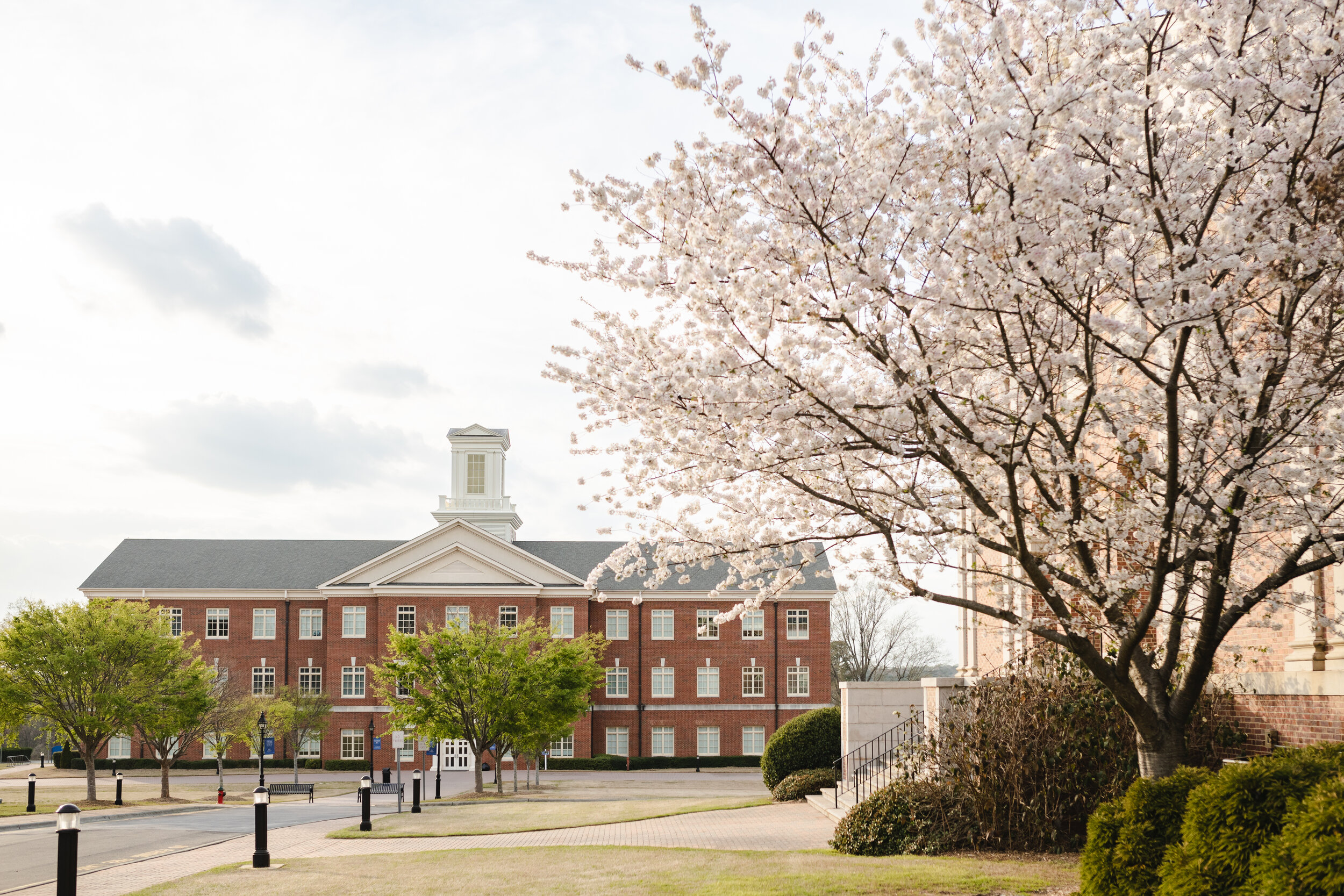
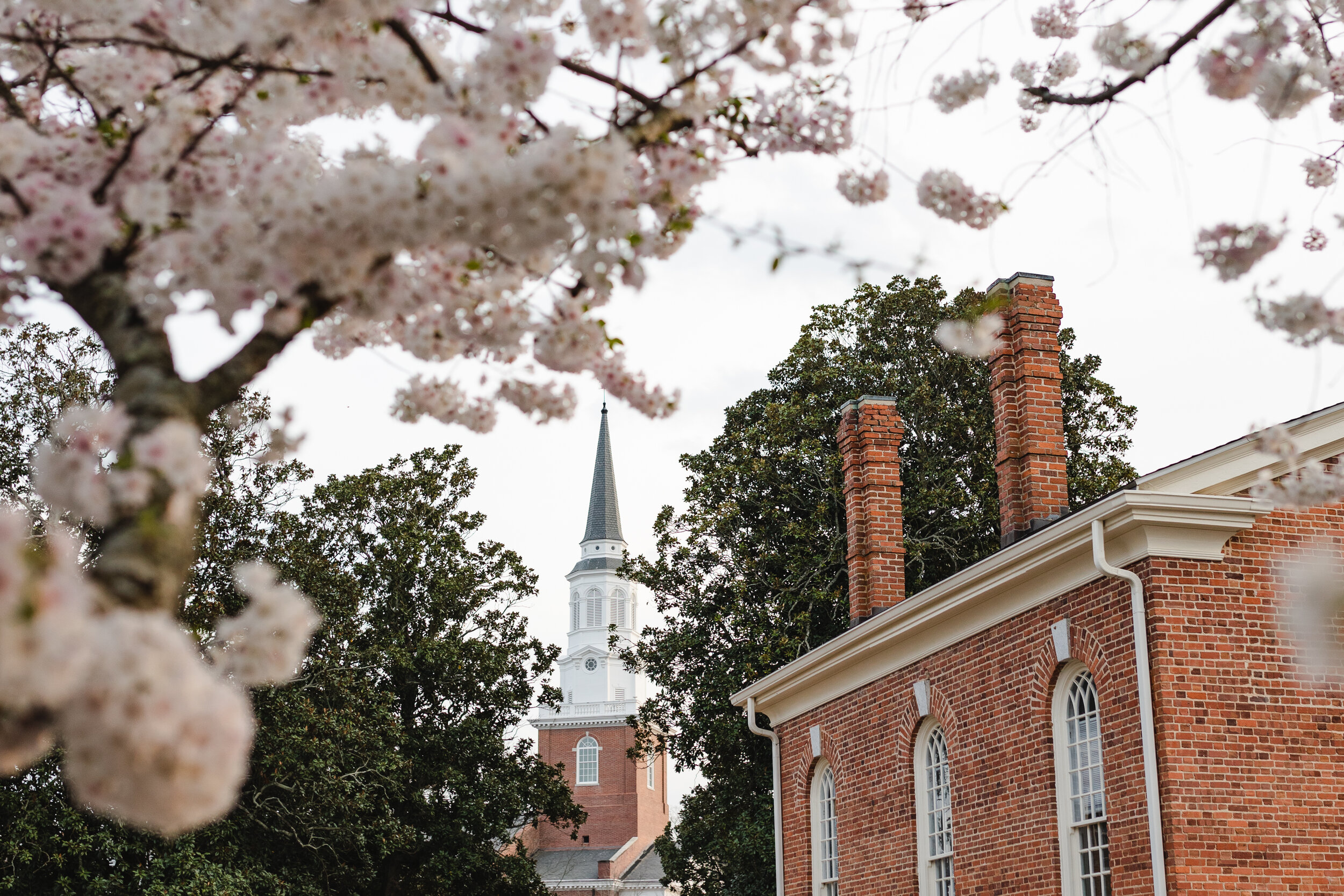
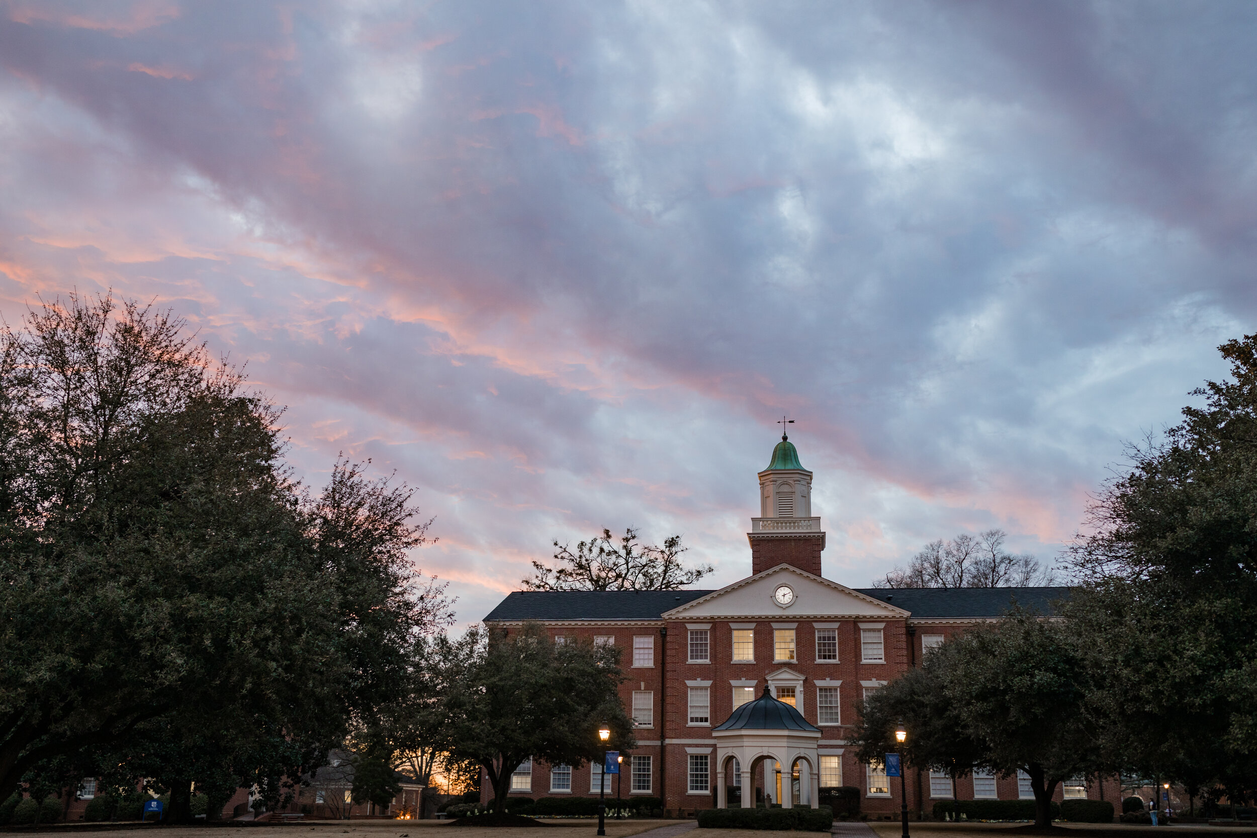
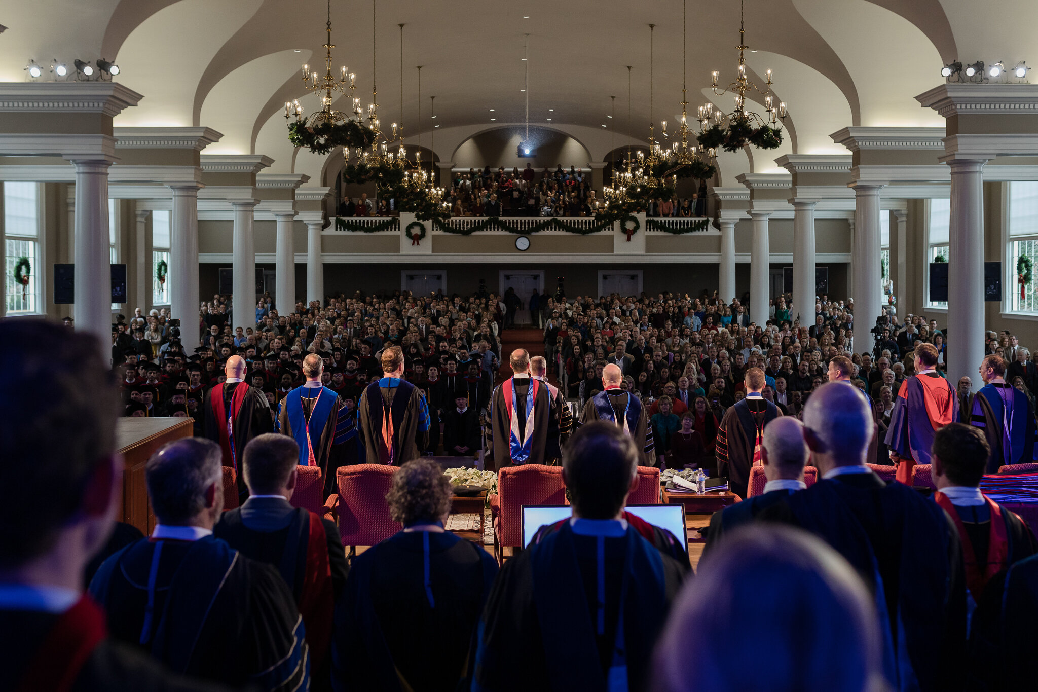
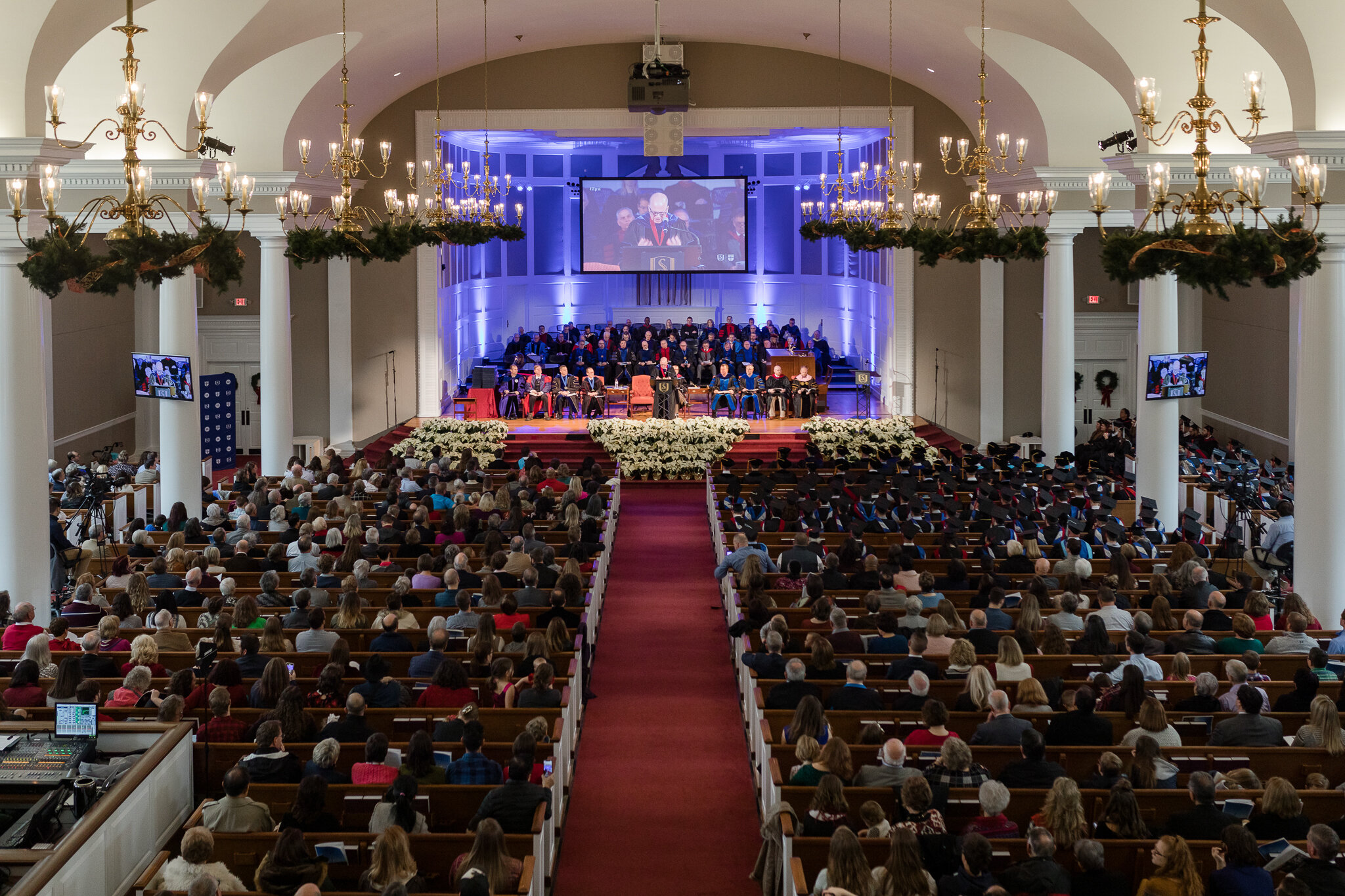
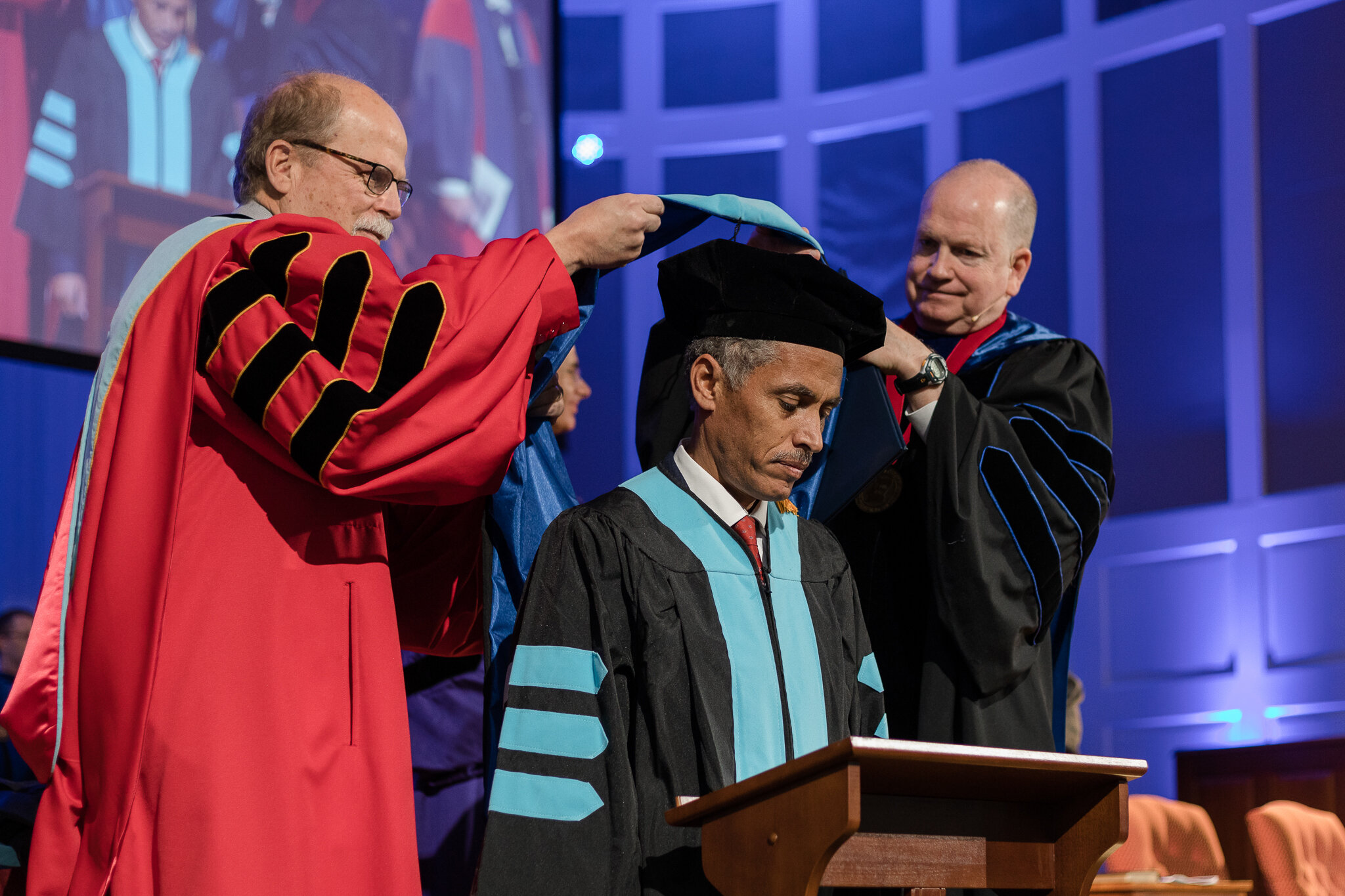
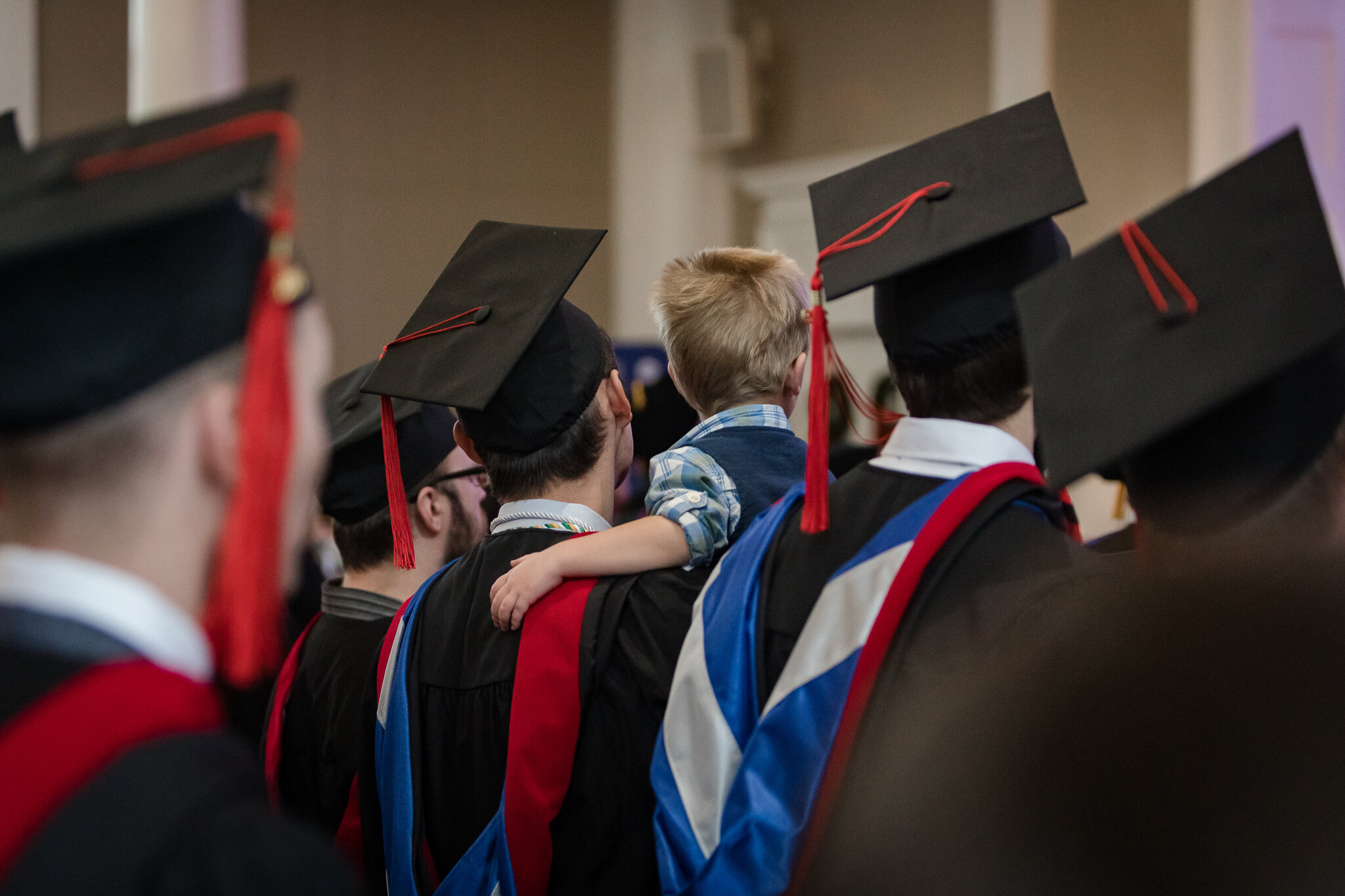
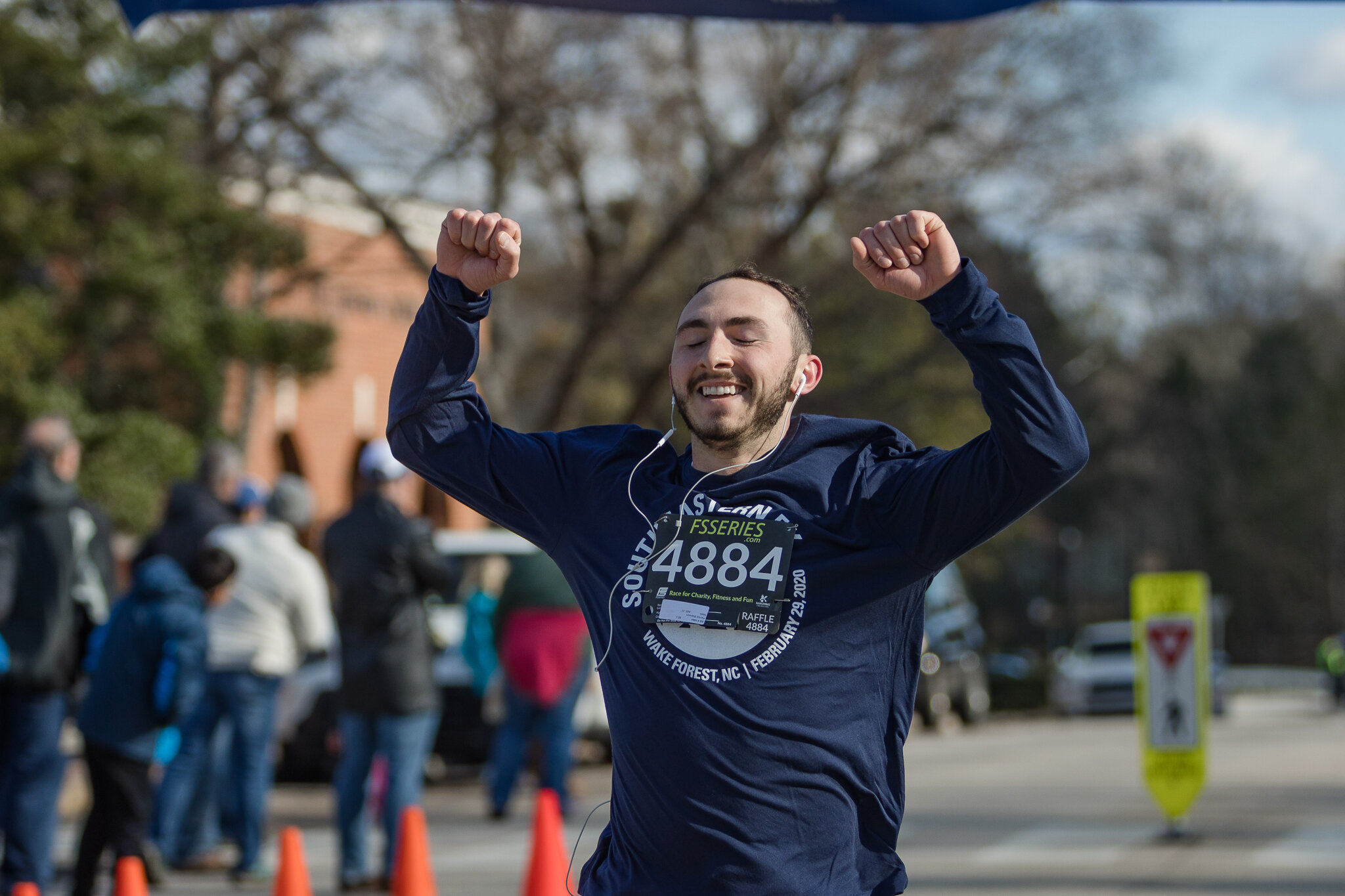
4. Photography
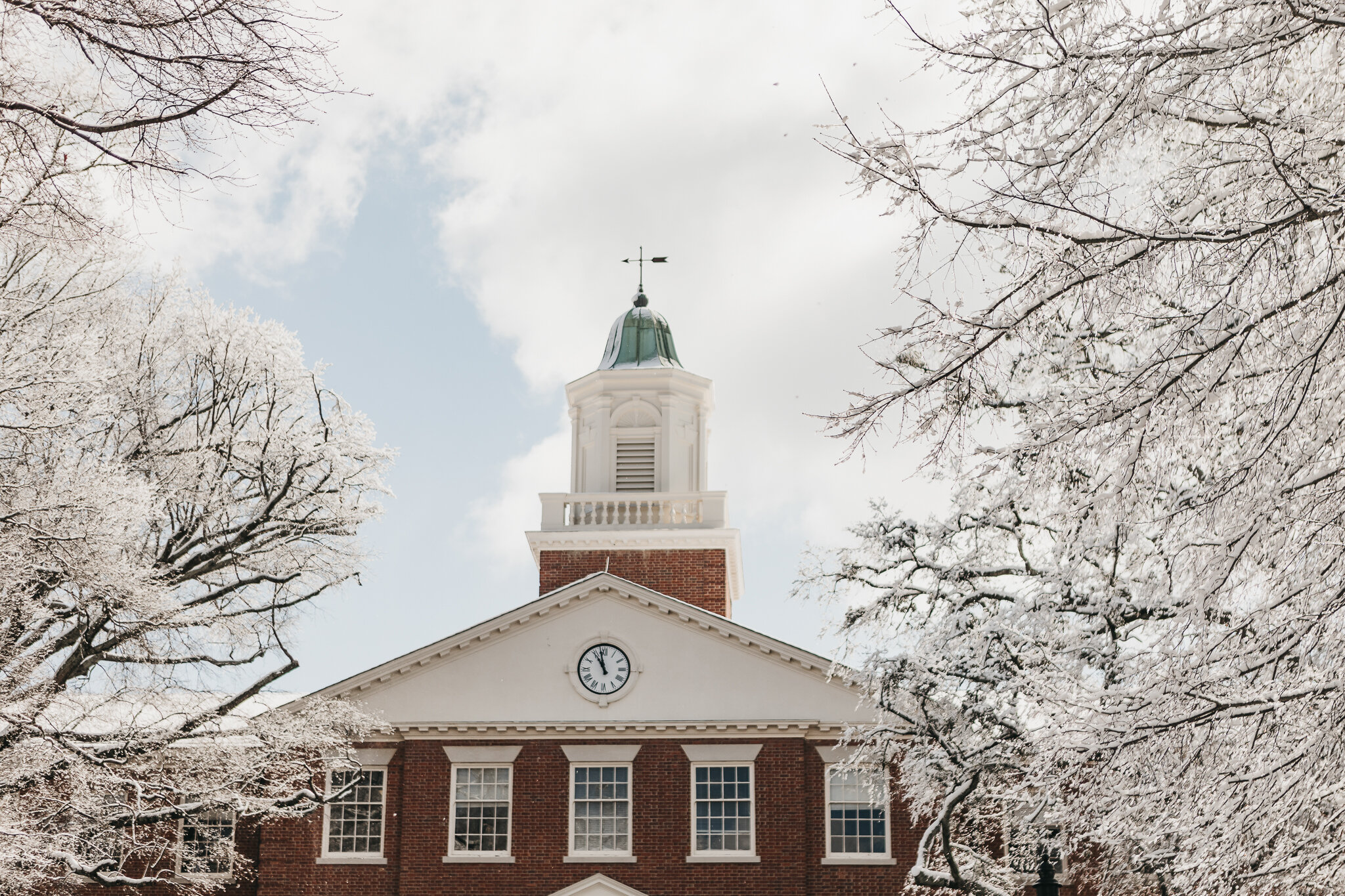
Images of the institution are an important part of the overall brand. When original photography is needed, using the professional photographers in the Office of Marketing and Communications is recommended. Their expertise in lighting and composition is essential to creating dynamic and engaging photos.


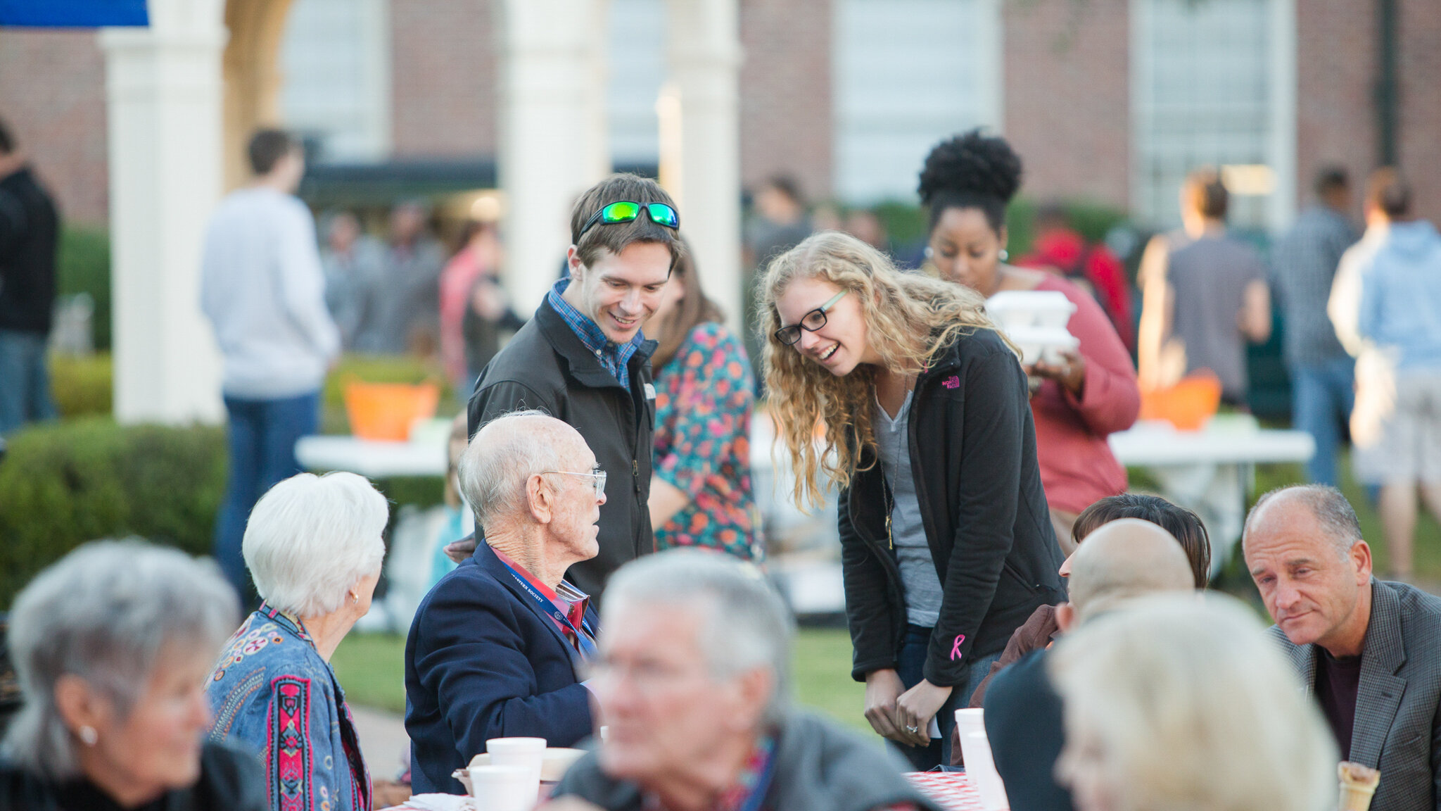
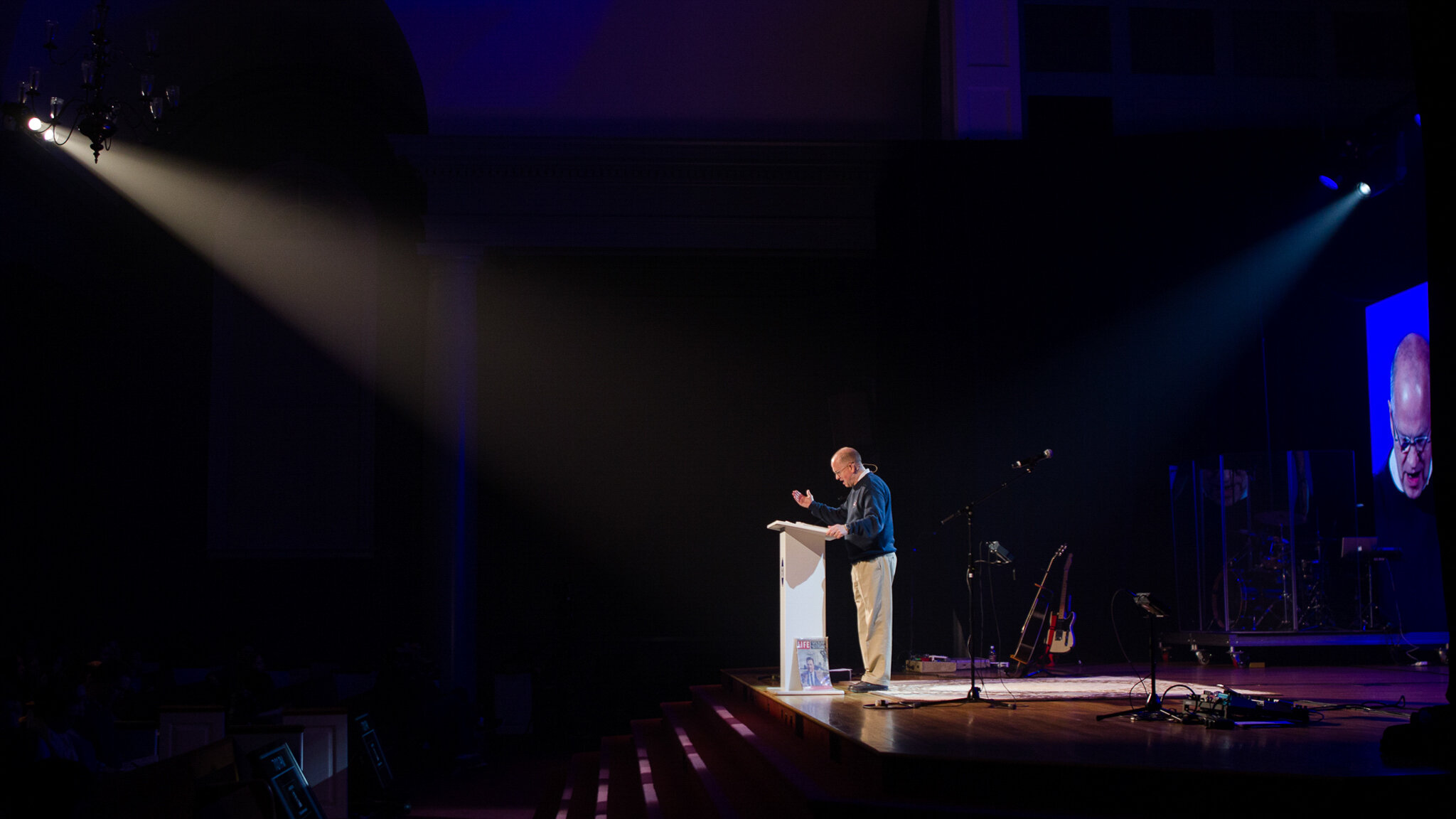
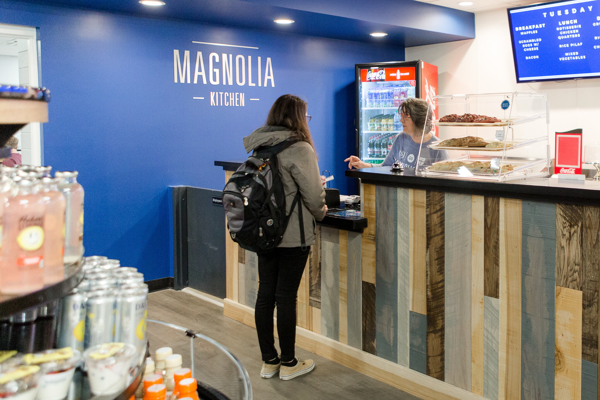
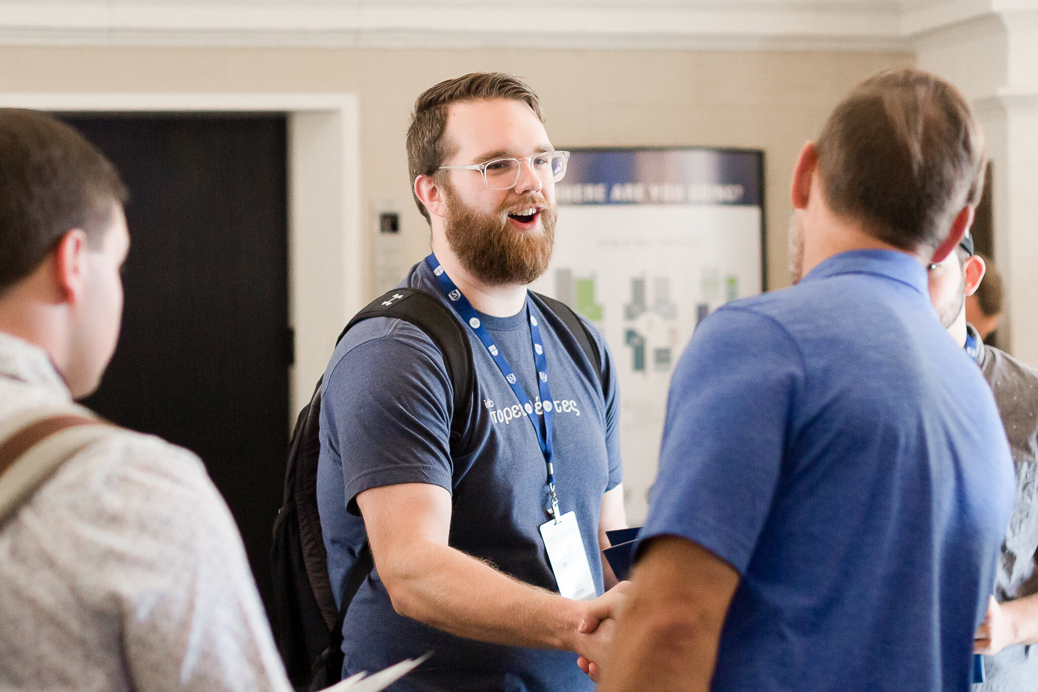

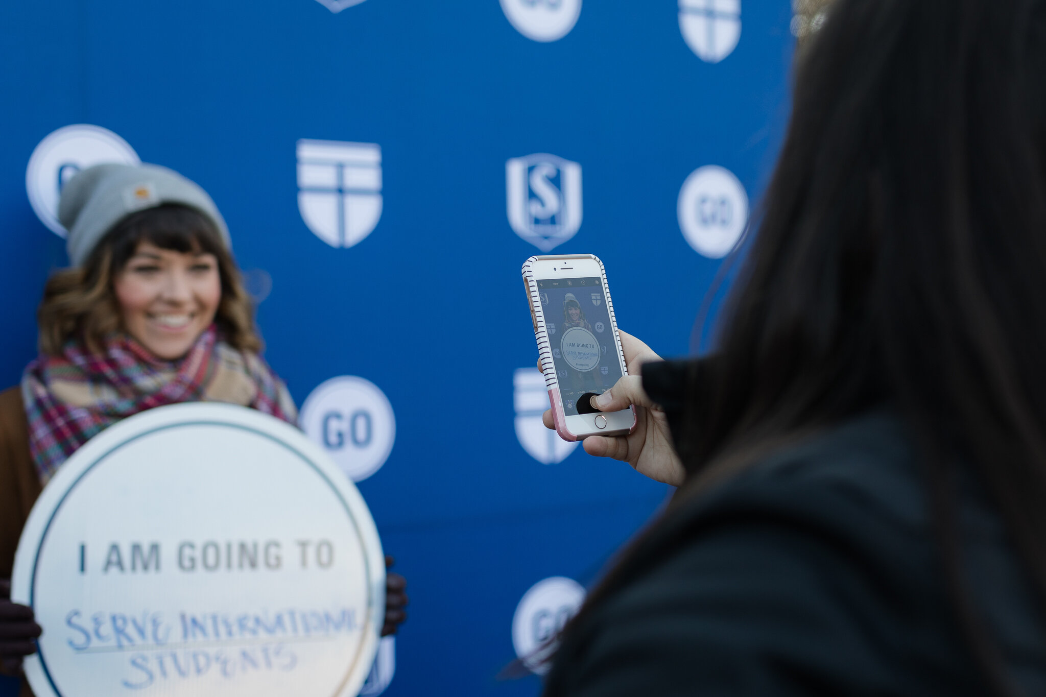
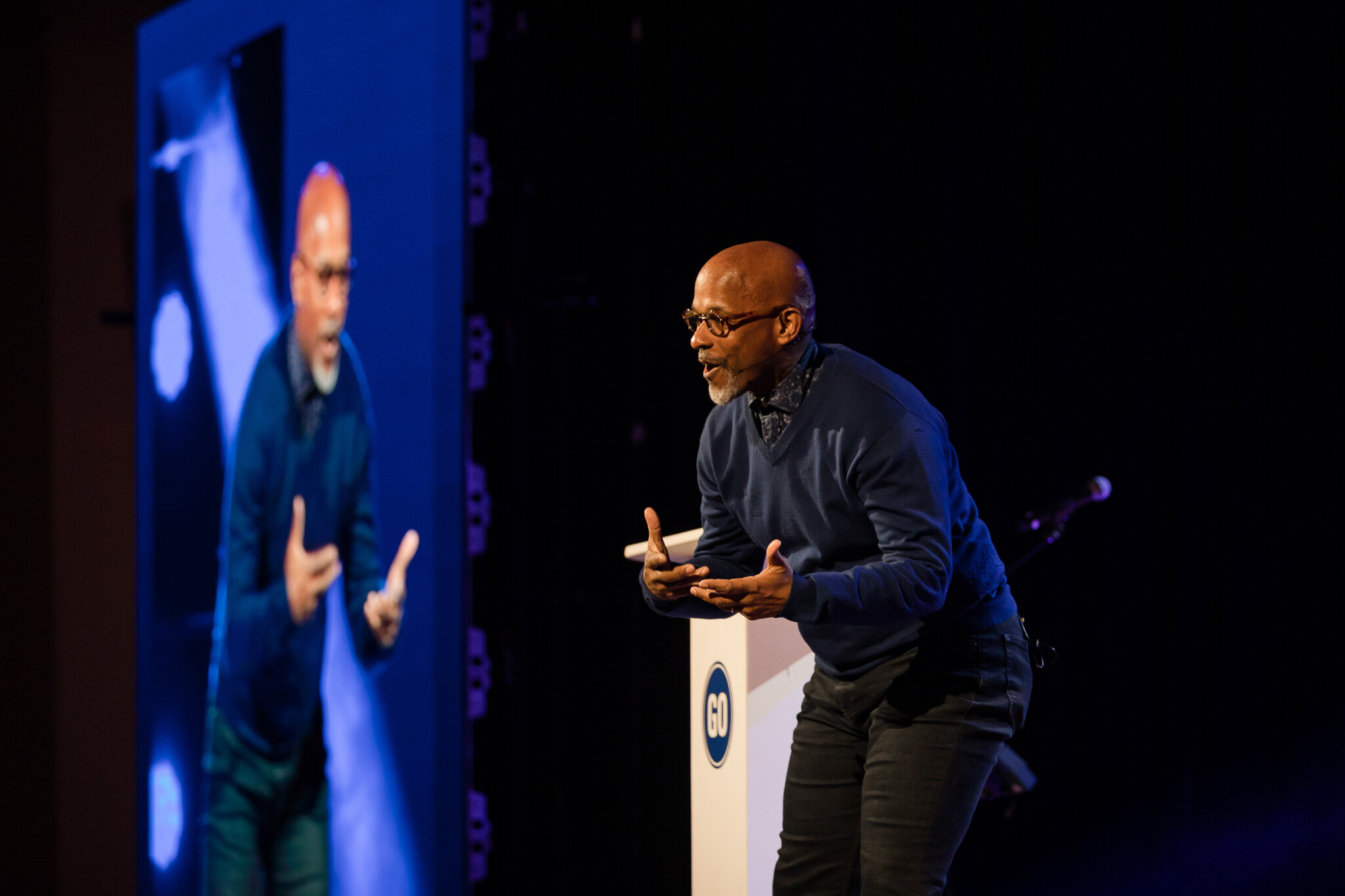
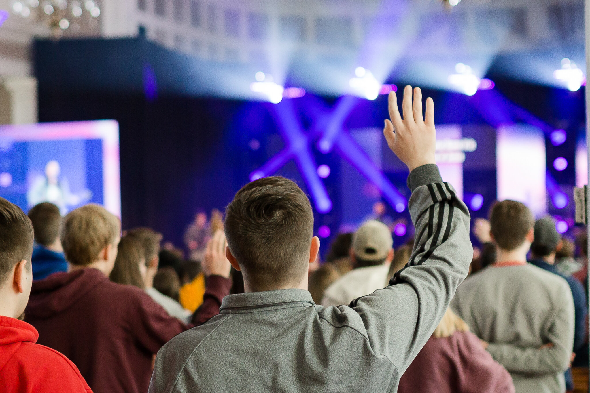


Our event photos on Flickr are web-resolution; should you need any of them in high-resolution for print or another purpose, please submit a request via the button above.
Our stock photos may be used for any institutional purposes. All photos are searchable by keyword. All image downloads are password protected to keep this database internal, and the password is sebtsgo. Please note: these photos are high-resolution and are safe to print, but may need to be sized down for online use.
Unless given permission, please do not use any photos that were procured from any source other than the above two SEBTS resources. If you have questions concerning this, or need a specific photo that cannot be found in the above sites, please fill out the form here.
Our entire existing event photography library can be freely accessed on our Flickr page below. These are low-medium resolution.
Our institutional photo database contains hi-res images to which we own complete copyrights. Password: sebtsgo
Click here to request new photography at an event, headshots, or specific existing photos in high resolution for print.
Resizing SEBTS Photos
Squoosh - allows for the most technical precision for those who know exact photo specifications needed
Adobe Spark Resize Image - more user-friendly while still offering a variety of resize tools, including specific social media dimensions
Simple Image Resizer - the most user-friendly option, only allowing for basic downsizing of photo files.
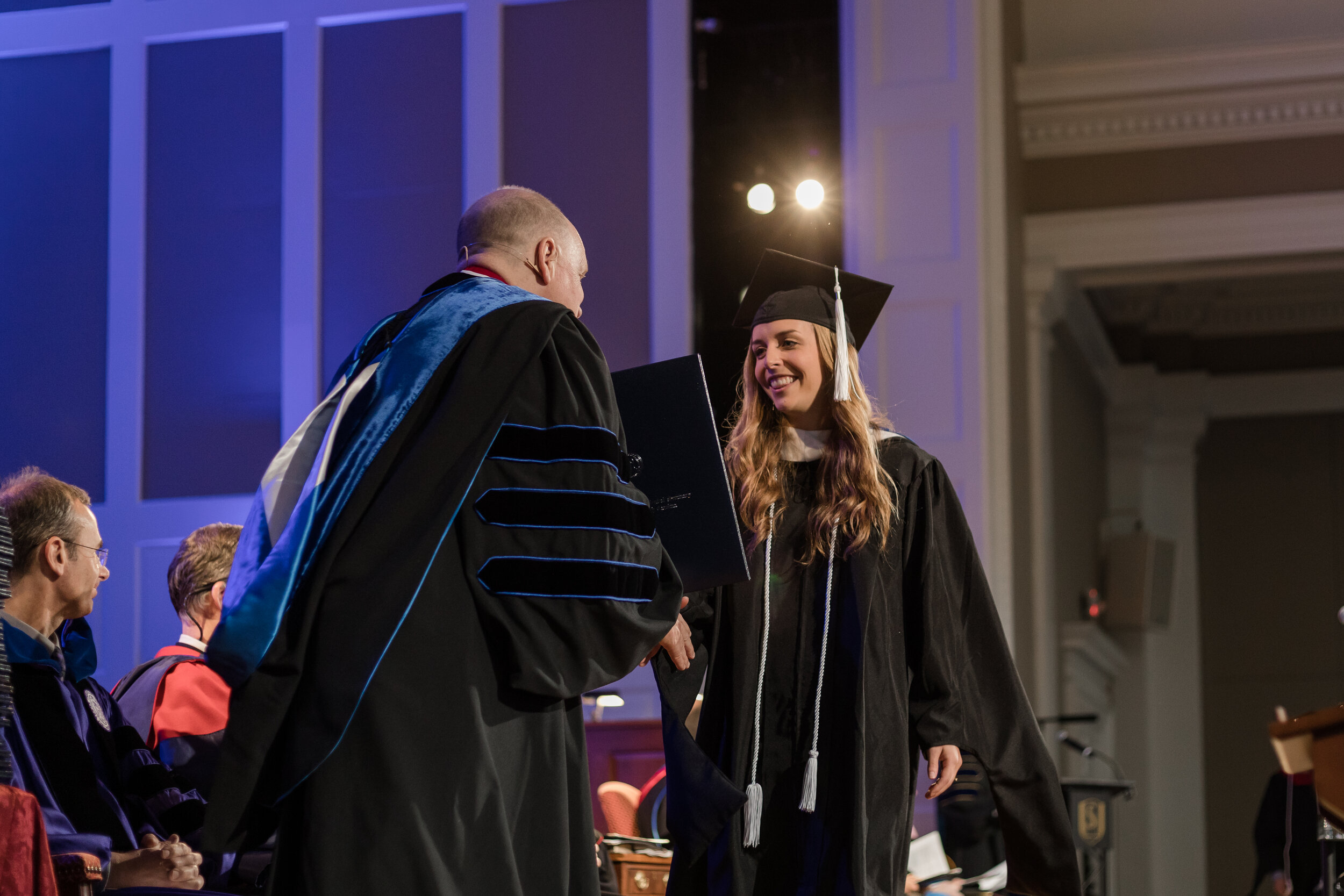
Proper Usage of SEBTS Photography


5. Writing Style
Written communication is a vital component of Southeastern’s overall brand. We want to ensure that all external communication is both consistent and clear. This includes written communication to prospective students, the community, external partners, events, etc. If you are unsure if your communication fits this category, we encourage you to ask. Consistency in written communication is essential in order to present a unified brand and message for Southeastern.
If you have any further questions regarding written communication at Southeastern, please contact us here.
We appreciate your cooperation as we seek to communicate more clearly and consistently across all offices.

Guidelines for external emails and documents:
When referencing the seminary or college, please use Southeastern Baptist Theological Seminary and Judson College at Southeastern.
In all subsequent references, use Southeastern (for the overall institution), Southeastern Seminary, or Judson College.
Please make sure all spelling, grammar, and punctuation are used consistently. This includes subject-verb agreement, active vs. passive voice, and formal language when necessary.
Make sure language is clear and concise, and refrain from using long and unnecessary sentences. As a rule of thumb, the longer the sentence is, the more confusing your message becomes.
Refrain from using bold/italics/underlining in excess. While they may be used in appropriate settings, they are not to be used for mere emphasis.
For lists, use bulleted or numbered lists when possible rather than long paragraphs.
Press Release Information
From time to time, you may have need of a press release regarding a new program, a new hire, or to announce an accomplishment.
For all press release needs, contact us at communications@sebts.edu.
Brand Quick Sheet
The Brand Quick Sheet is a PDF of this page’s content in highly condensed form.
You can send this to other staff in your office as a guide to better understand Southeastern’s visual brand and why it is important to follow these guidelines.
You may also wish to download this document to keep on hand as a quick reference for simple branding questions or needs.